It appears that the sign on page would be getting a new look to make it easier to navigate. And boy did it need it, after all, look at this mess:
 How anyone could figure out this mess was beyond me. The promises of having my log on process streamlined excited me to no end. Well, today I went to check my account and THE WAIT WAS OVER! I was able to see the brand new, streamlined, easier to use log in page:
Boy, what a difference! This new page is so much easier to use. Now, instead of having to type my card number and my password, I only have to type my card number and my password. Thank heaven that CIBC is here to make my life so much simpler!
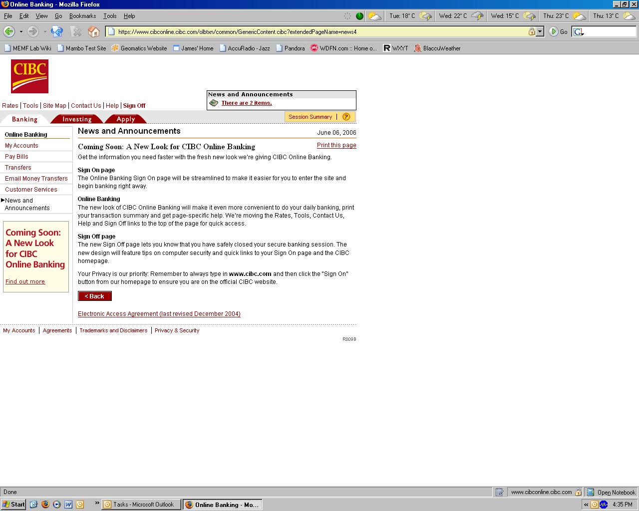
Another improvement they promised was to move the "Rates, Tools, Contact Us, Help and Sign Off links to the top of the page for quick access." And indeed, they did deliver on their promise. The header for the pages went from this:
 To this:
Yep, that's much better, now the links for these useful things are SMALLER, and FARTHER AWAY from where the banking is done. Good thinking on that one. I know when I want "quick access" to something I always make it harder to get to. That's why when I get home I always take my keys and wallet and tape them to the ceiling in my shower with three rolls of duct tape, that way I can have "quick access" to them whenever I want them.
I think what scares me the most, is that this was probably the result of some 6-figure study into what the best way to "serve their customers" was. It's change for the sake of change, a make-work project if you will. I have no problem with the bank trying to improve service, but when you promise improvements, maybe you should deliver actual improvements. Or is that too complicated?


6 comments:
You know, I can actually see user interface improvement. They're not obvious things, but concepts that over time have been discovered through lots of observation and psychology. A lot of it has to do with subconscious perception and browsing. :P
Streamlining != more empty real estate on the page. What it looks like they done is reorganized the content to better fall in line with the principles of c.r.a.p.:
Contrast: Different sections and concepts need contrast between them to help the user scan the page faster. Paragraphs are broken into different groups separated with a section title with a larger font. Content frames are broken up with a different background color. Stuff like that. You'll notice your login form is now contained within a yellowish box. For a new user to the page, they could be finding that form 1-2 seconds earlier. While that sounds dumb, it really helps with user perception and satisfaction.
Repetition: Keeping style constitent throughout the entire site. If the top banner is red on one page, keep it red throughout the site. Main content frame broken into 3 columns of text? Love it completely or abandon it. This one is very important, cause a sudden change in style can be jarring to the flow of page navigation, which leads to confused users who can't find what they're trying to find, even if its right in front of them!
Alignment: From what you posted this one was already being adhered to by the looks of it. But its a simple concept that can help a long way. Justifying text and images along horizontal and vertical lines can do wonders.
Proximity: Keep related things together, and unrelated things apart. You'll notice in that banner you posted that the top-level links we're moved away from the self-banking tabs. They're all related in function (top-level links) so they remain together. However they're not related to anything else on the page since they lead away, so they're moved outside to above the banner. This is a good place for them since users spend most time on the top portion of the page, so they're navigation times will go down.
That's it really. Usability Studies is a real field and they obsess over shit like this in websites and application interfaces.
k I'm done :P
I admit you make some good points, and I'l agree that aesthetically (sp?) it's more pleasing, but I believe in function before form, and not the other way around. If they had marketed it to me as a "new, fresh look" or something to that effect, I wouldn't have had such a beef with it, but the website offers no new functionality. That c.r.a.p. acronym is something I've never heard, and I'll have to write that one down because I'm the last guy to consult when it comes do designing a UI.
Personally I preferred the "tabbed" look, it makes the site feel more cohesive instead of being broken into a series of pages (IMHO).
Your point about keeping related things together is a good one, though I don't think they did that on either banner. To me "Rates" and "Tools" are more banking stuff, whereas contact, help, and log off should stay together. I guess I'm splitting hairs at that point though (although that seems to be what I do best).
And I know that usability is a big field, but usability studies are what likely created the "ribbon" idea for the new MS Office suite, and I fully expect that idea to fail miserably. I just think if you're going to make insignificant changes, it's not worth making them because you just confuse people. I didn't even notice any of these changes until I went to log off and the link wasn't where I thought it was. If the page had been radically redesigned I would have expected that the link had moved, but with the subtle changes it's hard to notice.
I suppose it's all a matter of opinion, and the majority of users may prefer this style. And as usual, I tend to buck the trend of what the minority thinks. That's why I have a blog, so I can share my useless gripes :)
Whoops, that should have been "...buck the trend of what the majority thinks".
Well if I remember right CRAP only applies to web design, so I think you're fine.
Wow, this is perphaps the most nerdish discussion I've seen in a while ;)
Hey, you leave two computer science geeks together and this is what you get.
Go back to your physics and your electricity and marvel at the incredible software that we make so that the world can be a better place!
And hey it could be worse, I could make this a discussion on ontologies...is that what you want?
Computer scientists run the world! MWAHAHAHAHAHA!!!!!!!!!
Post a Comment